Table of Contents
- Introduction
- Why Color Matters in Design
- Warm vs. Cool Colors: How They Affect Mood
- The Role of Neutral Colors
- Cultural Meaning of Colors in Design
- How Interior Designers Choose Colors
- Practical Examples: Colors in Homes, Offices, and Public Spaces
- Why Students Should Learn Color Psychology
- Learn Interior Design at Deseret School of Design
- Conclusion
Introduction
Have you ever walked into a room and instantly felt calm, energetic, or even overwhelmed? That reaction often comes from the colors around you. In interior design, colors are not just about beauty; they have the power to affect human emotions, behavior, and even productivity. This is what we call the psychology of color.
Why Color Matters in Design
In design, colors are more than decoration. Furthermore, they guide how people feel and interact within a space. For example, hospitals often use light blues and whites to make patients feel calm. In contrast, restaurants use warm colors like red and orange to encourage appetite and social connection.
Warm vs. Cool Colors: How They Affect Mood
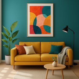
Warm Colors (Red, Orange, Yellow) create energy, passion, and excitement. That’s why they’re common in restaurants, cafes, and entertainment spaces. In contrast, Cool Colors like Blue, Green, and Purple promote calmness, relaxation, and balance, making them perfect for bedrooms, offices, and spas.
The Role of Neutral Colors
Many modern homes and offices use neutral palettes because they create a sense of space and simplicity, thereby allowing neutral shades – white, grey, beige, and black – to act as balancing tones. In turn, they provide a clean and timeless background for bolder colors. Furthermore, this approach to design enables flexibility in decorating, and additionally, it makes it easier to introduce accent colors or patterns without overwhelming the space.
Cultural Meaning of Colors in Design
The meanings of colors can vary depending on the culture. For example:
- In Ghana, white often represents purity and celebration.
- Similarly, in China, red symbolizes good luck and joy.
- Meanwhile, in Western countries, black is often associated with elegance, as well as mourning.
Consequently, designers must be aware of cultural meanings when designing spaces for different communities.
How Interior Designers Choose Colors
Professionals don’t just pick colors randomly. They consider:
- Function of the space (a classroom needs focus colors like green or yellow)
- Lighting (natural light vs. artificial light affects color perception)
- Cultural context (traditional vs. modern preferences)
- Client’s personality and goals

Practical Examples: Colors in Homes, Offices, and Public Spaces
- Homes: Bedrooms often feature soft blues to evoke calmness; kitchens may incorporate yellow to create a lively atmosphere.
- Offices: Many tech companies use blue to promote focus and trust.
- Public Spaces: Airports use neutral and soft tones to reduce stress in travelers.
Why Students Should Learn Color Psychology
Understanding color psychology is a core skill for interior designers. Furthermore, it gives them an advantage in creating designs that not only look good but also make people feel comfortable and inspired.
Learn Interior Design at Deseret School of Design
At Deseret School of Design, our Interior Design course teaches each student how to apply design psychology in real-life projects. You’ll learn how to use colors effectively, plan spaces with purpose, and create environments that inspire people.
Start your design journey today with Deseret School of Design. Enroll now and turn your creativity into a professional career.
Conclusion
Colors are powerful tools in design. They influence how people feel, behave, and connect with spaces. By understanding color psychology, designers can transform simple buildings into meaningful experiences. Whether you are creating a cozy home, a vibrant office, or a calm hospital space, in essence, choosing the right colors makes all the difference.